Here is a curated list of tips that should work on GitHub, some might be more obscure than others or could be interesting to note. If you are looking more tips and secrets, the GitHub blog have some articles available about tricks and hacks. There’s a finite amount of them, so you may see some of them there too.
GitHub flavoured Markdown
Keyboard keys
This one is not really GitHub only, but pretty cool to know when you want to give keyboard keys to type. It adds an overlay around the text:
- For example: ctrl , using
<kbd> ctrl </kbd>
And as you guessed it kbd is short for keyboard hence the look.
Expandable
For expandable content, or details as it’s called in the HTML world:
<details>
    <summary>Click here!</summary>
    hidden until you click
</details>
Which should render similarly in GitHub:
Click here!
hidden until you clickDiagram
For diagrams, you have the possibility to use mermaidJS, directly within GitHub which was announced in 2022:
```mermaid
graph TD;
    A-->B;
    A-->C;
    B-->D;
    C-->D;
```
Which should display a diagram like this one:
They have been working with Mermaid’s creator to incorporate the library to the GitHub flavoured markdown for inline graphs
Links
Markdown links, this one is more generic, but a nice trick, there are several ways to add links in markdown:
- With the link directly after:
[my blog](https://sylhare.github.io) - With the link at the bottom and a reference in the text:
[my blog][1] [1]: https://sylhare.github.io - Using the text as the reference for the link at the bottom
[my blog]

[my blog]: https://sylhare.github.io
I tend to prefer the second one, as it looks better than using the text and can be used at more than one place.
Also, GitHub auto provides anchors on title in the Readme which you can access directly using #, For example, you
could use [click here][#Links] to get to the links title on the same page.
Colors
Use the backticks on hex colours to display them with a coloured square next to it:
Look at these colors `#0087d5`, `#FF66dd`, `#5BCD98`

A nice touch 👌
GitHub features
File finder
Last one is not even related to the markdown, but if you are looking for a file using t gives you the ability to search through the files in the repo which can be handy to find what you’re looking for faster.

This functionality is referenced as the File Finder received some makeover, you can customize from which
folder to look for using the linguist in the .gitattributes.
By default, it ignores everything from the vendor/ and build/ folder, because it’s usually external or generated code,
not pertinent to search from.
To mark the file search/example.json as a generated file to be ignored, add this line to .gitattributes:
search/example.json linguist-generated=true
And it won’t show up in the search results. There’s also a linguist-vendored you can use, checkout the documentation.
For Pull Requests
Template
You can add a Pull Request template to your repository, it can be in multiple places (root, docs) but I prefer to have it in the .github/ folder
Create a file called PULL_REQUEST_TEMPLATE.md and then add within it what you’d want your Pull Request to have by
default when opening it. Don’t add too much though, as it can be a bit of a turn-off to have to remove the text each
time if it’s never needed.
For example:
### Description
<!-- What your PR is about -->

### Screenshot
<!-- If you've modified the UI -->
The HTML comment won’t be shown once saved and allow for simple indications on what to put. If you like saving time, the same can be done for the issues! And if you are using issues, you may also want to try the saved replies features for automating some common answers you might give in an open source project.
Code Review
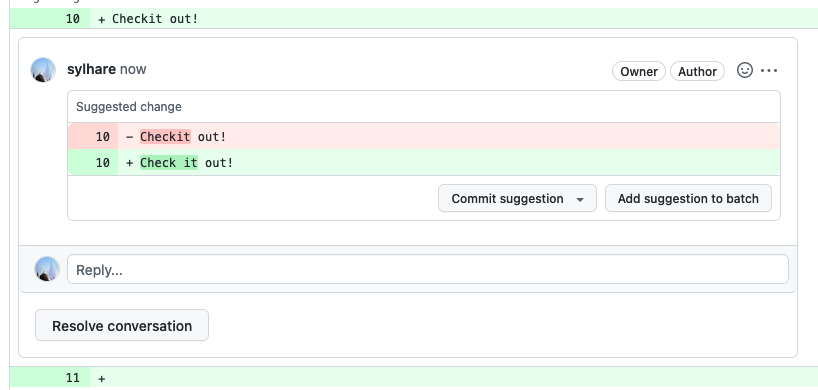
For PRs to make a suggestion that can then be committed by the PR’s author if interested (either one at a time or in bulk). Useful to fix a type on the fly:
Missing space:

```suggestion
Check it out!
```
So your suggestion can be committed from within the code review message, if you just put the suggestion it will show up ad suggested change, so I tend to add an extra message to it, so it’s less raw. Your fellow dev might like some additional context if you’re suggesting something more complex 🙃

If you are using git diff, you can also use the highlighter diff so it makes it more readable. However, if readability
is the goal, it’s better to go straight into the file section of the PR. 🤷
Also in the readability part, you can click on the top left of a file to display it all. This usually helps grasp the context on bigger file where it can become tedious to repeatedly click on the expand button to see the code around.