Flexbox (Flexible Box Module) was designed as a one-dimensional layout model, meaning that you align and distribute item through one direction (either horizontal or vertical). It is very powerful and allow your layout to dynamically adjust based on the size of the screen.
Introduction
Working with HTML
Let’s say you have multiple elements that are nested like this:
<div class="container">
    <div class="item"> ... </div>
    <div class="item"> ... </div>
    <div class="item"> ... </div>
</div>
And you want to make sure that they are all align, and well. With the proper class assign like that we can now jump to the CSS part
Flex your CSS
For the container
Flexbox works with a flex container which has a flex display:
.container {
  display: flex;
}
Other nice attributes for the container:
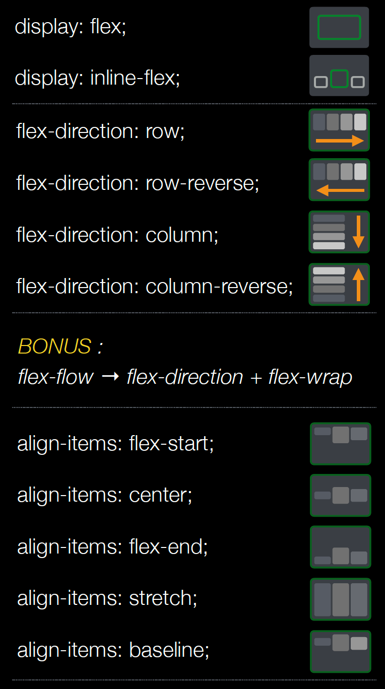
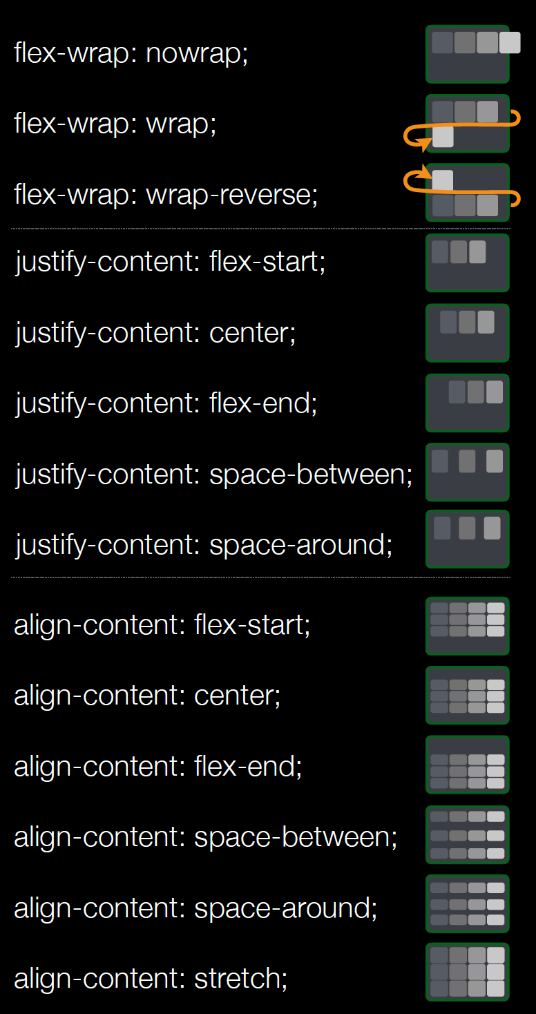
flex-direction: to decide which direction (roworcolumn) the item are going to be displayedflex-wrap: to avoid items overlaying the container, withwrapthey’ll automatically go on the next directional leveljustify-contentwithalign-items: To align items depending on the flex direction.
For the items
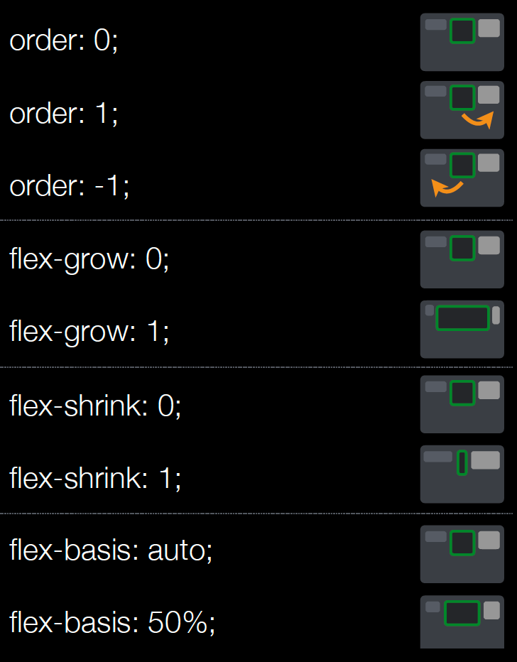
A flex item that has different attributes:
.item {
  /* default flex value, also called 'initial' */
     flex: 0 1 auto;
  /*
   * Which are the values for:
   * flex: flex-grow flex-shrink flex-basis
   */
}
Here are what each of them do:
flex-basis: relative size elements in the direction (50%means it takes half of the container)flex-grow: with0stays original size, with1take the remaining space if anyflex-shrink: with0stays original size, with1if too big, will fit inside parents
The flex-grow, flex-shrink numbers can also act as a ratio, sharing a portion of what’s available depending on the number. For the size and flex-basis, there’s a hierarchy between elements, conflicts are handled through that hierarchy.
Reminder
Flex Container
Everything to control your flex container:
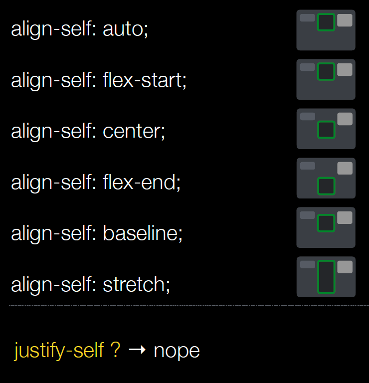
Flex Item
All attributes you can use to manage your flex items:
Tips
Here are a list of problems and solution of flexbox related issues:
- Display flex makes all images stretched.
- To fix it:
align-self: flex-start
- To fix it:
- Display flex text over flow on word wrap
- To fix it:
min-width: 0(to be in reset css file). Because it’s overwritten with auto
- To fix it:
- Display flex items width are not equal
- Either use
width: 50%orflex: 1to size components. Because model sizing is not the same.
- Either use
Sources
- Alsa Creation for the images
- Mozilla flexbox for the specs.
- CSS ticks for a guide to flexbox
- Cheat sheet by @sakamies